Dimensionality Reduction
PCA, UMAP & t-SNE: Visualizing the Map of Your Data
What It Does
A single spatial metabolomics sample can contain thousands of detected metabolites, making it impossible to visualize the data directly. Dimensionality reduction techniques simplify these highly complex datasets. Algorithms like PCA, UMAP, and t-SNE project this high-dimensional data into a low-dimensional space (typically 2D or 3D) while preserving the essential relationships between the data points (i.e., the pixels or spots).
Why It's Here: Your First Exploratory Step
This is often the first and most crucial step in any exploratory analysis. It provides a high-level "map" of your data's overall structure, helping you answer fundamental questions such as:
- Do my experimental groups (e.g., 'Treatment' vs. 'Control') form distinct clusters?
- Is there unexpected metabolic heterogeneity within what I assumed was a single tissue type?
- Are there any outlier samples that behave differently from the rest of their group?
What You Get: Interpretable Plots
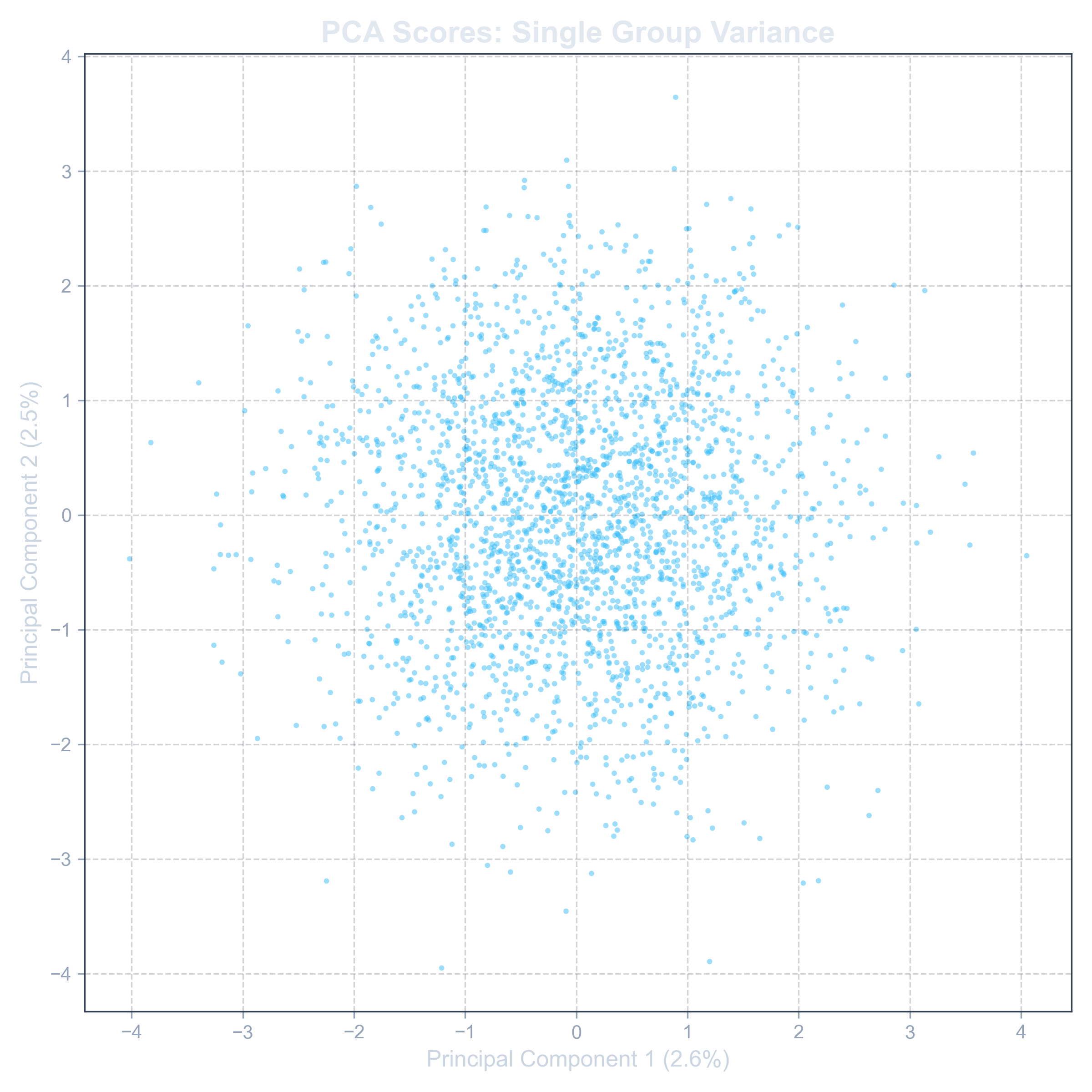
The primary output is a Scores Plot, a 2D scatter plot where each point represents a single spot from your sample. The proximity of points on this plot directly reflects their metabolic similarity. Spots that are close together are metabolically similar; spots that are far apart are different. When colored by experimental group, this plot instantly reveals the structure of your data.
For PCA, you also receive two additional plots:
- Loadings Plot: This shows which specific metabolites are the most influential in driving the separation you see in the scores plot.
- Scree Plot: This indicates how much variance each "principal component" explains, helping you judge the robustness of the analysis.
Example: UMAP Scores Plot
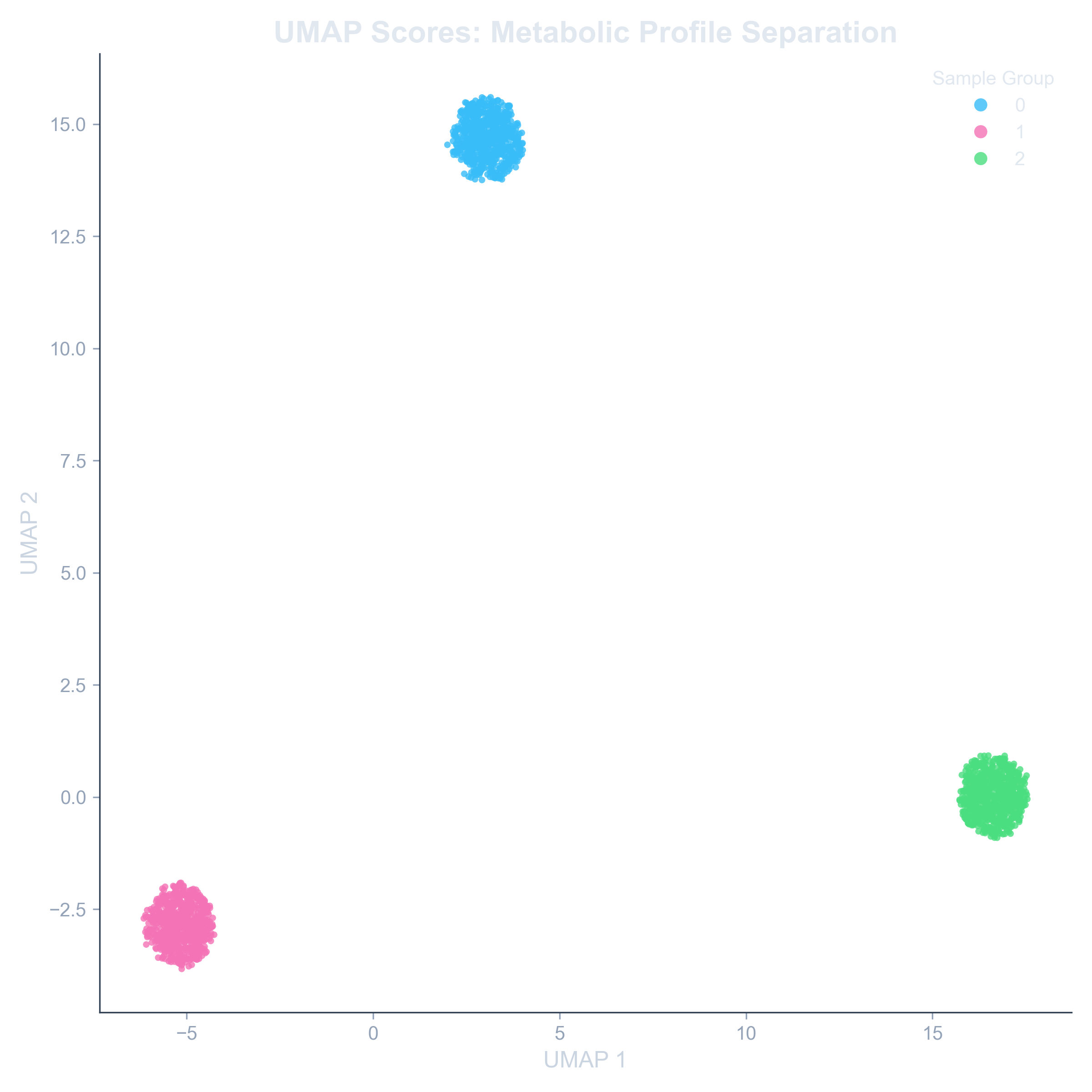
A UMAP plot showing clear separation between two experimental groups, indicating a strong metabolic difference.
Example: PCA Loadings Plot
A loadings plot highlighting the key metabolites responsible for separating the groups.